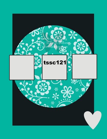
I wanted to use Stampin' Up!'s new Sentimental Journey stamp set in a more feminine set of colors! I've only used it in the masculine colors that go along with the Travel Journal Designer Paper! So, I chose Technostamper's Monday Lunchtime Sketch Challenge (TSSC121) to come up with a layout for my set.
Well…you know how something gets stuck in your head! I wanted to use the luggage image in different colors, so I tried "forcing" it into the sketch. Hmmm…not so much! But, I thought I'd show you my first try, and show you how I worked it out! I'd love for you to leave me a comment and tell me which card you like better when I'm finished!
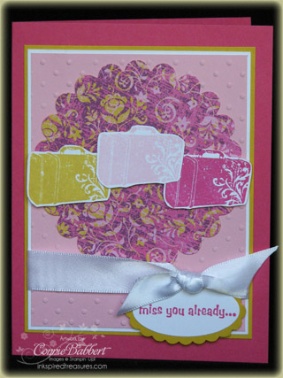
OK…the first one. I had the Scallop Circle #2 cut from Razzleberry Lemonade Designer Paper already in my scrap pile. I layered it on Pretty In Pink that I ran thru the Big Shot with the Perfect Polka Dots Impressions Folder. I layered that on Whisper White and then Crushed Curry. I wrapped the White Satin Ribbon around (to tone down the colors) and added the Miss You Already greeting from Really Retro (sorry…this was in my current stamp set storage…I didn't realize it had retired!) and punched with the Large Oval, then the Scallop Oval from Crushed Curry. I added the suitcases stamped in Pretty in Pink, Melon Mambo and Crushed Curry Classic Inks. Everything was placed on the Melon Mambo base card.
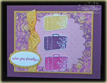
So, for my next one, I decided to flip the sketch on it's side! I used the Razzleberry Lemonade print in the background and layered it on Crushed Curry cardstock. I brought the Pretty in Pink Scalllop #2 circle to the front. I ran it thru the Big Shot with the Perfect Polka Dots Impressions Folder for some texture. I wrapped the Crushed Curry Polka Dot Ribbon and tied a knot, this added a little brightness to the darker colors. I stamped the greeting again and punched with the Large Oval, then the Crushed Curry Scallop Oval. I stamped the suitcases in Melon Mambo, Crushed Curry and Rich Razzleberry Classic Inks. Finally, this was placed on a base card of Rich Razzleberry.
So…ok…leave a comment and tell me which one YOU like better and why! I'd love to hear from you!
.png) If you haven't checked out the Create with Connie and Mary site yet, now is the time to do it! We feature new Summer Mini products every week. There is a new project posted every day and there will be a minimum of two fabulous tutorials each and every week. We like to have lots of fun so we have challenges and prizes for our subscribers. Our site stays up long after the session is done, so you will always have access to the site and the tutorials. For more information and to see our Preview Week projects please visit at Create with Connie and Mary!
If you haven't checked out the Create with Connie and Mary site yet, now is the time to do it! We feature new Summer Mini products every week. There is a new project posted every day and there will be a minimum of two fabulous tutorials each and every week. We like to have lots of fun so we have challenges and prizes for our subscribers. Our site stays up long after the session is done, so you will always have access to the site and the tutorials. For more information and to see our Preview Week projects please visit at Create with Connie and Mary!

I like the colors of the first card because they are lighter maybe more summery but I like the layout of the second card better. I feel the suitcases on the first card get sort of lost because they overlap and separating them on the second card focuses the eye on them better.
Sue Erickson aka The Soggy Stamper
I really like the first one better not only because of the way the colors are presented, but how the eye is drawn to it, even though the middle suitcase kind of 'floats'.
I like the second one better. the suitcases seem crowded on the first one but have plenty of space and stand out better on the second. I like the fact that you "branched out" into different colors than those in the DSP! Thanks!!
I will have to go with the first one…but I think it is mostly the colors!
I like the second one better— from the original layout, I did not know that the the white blocks were suitcases. Second card is just a little more my style. Thanks for showing the two, enjoy that as much as the cards themselves. Shows others struggle with the design too. Blessings
Funny don't seem that you are getting much help, pretty even, lol. Fun cards, I love the sketch flipped. Great sentiment to add to them. So my vote is for the second one. Thanks so much for playing along.
I really like the second card better. The suitcases seem to get lost in the first card, but really stand out much better in the second card. It just seems like the second card has much more appeal to me. Great job on that one. Thanks for sharing. Thanks also for the Create with Connie Site. Have a wonderful Tuesday.
Cyber hugs, Trish in Wisconsin
Connie – I like the second card better. The colors are great on both but there's something about the suitcases on the first one that, IMHO, just doesn't fit with the sketch. The suitcases on the first get lost in the pattern of the scallop circle. On the second card everything just fits together nicely. It might be because the second one is flipped, but for me I think it's because the scallop circle on the second is a plain and light color. The suitcases just pop. I'm glad I'm not the only one with the "what's wrong with this" problem. TFS
Hugs – Marlene
The first card made me kinda dizzy, so i am glad I re-read your info and took a second look. The 2nd card is wonderful; everything works! Congrats for sticking to it until you had a winner.